- Loading…

Over the course of three days, participants will collect and analyze climate data from various software. The collected data will be analyzed by AI and visualized using graphic software to create impactful designs. On the last day, participants will be introduced to digital fabrication, transforming the data into a digital manufacturing prototype.
على مدار ثلاثة أيام، سيقوم المشاركون بجمع وتحليل بيانات المناخ باستخدام برامج مختلفة. سيتم تحليل البيانات التي تم جمعها بواسطة الذكاء الاصطناعي وتصويرها باستخدام برامج الرسوم لإنشاء تصميمات مؤثرة. في اليوم الأخير، سيتم تعريف المشاركين بالتصنيع الرقمي لتحويل البيانات إلى نموذج تصنيع رقمي.
Computers, phone for monitoring, internet access, printer, glue, scissors
أجهزة كمبيوتر، هاتف للمراقبة، اتصال بالإنترنت، طابعة، غراء، مقص
After attending this session, participants will be able to:
بعد حضور هذه الجلسة، سيكون المشاركون قادرين على:
1. جمع وتجميع بيانات متعلقة بالمناخ:
سيقوم الطلاب بجمع بيانات شاملة عن المناخ باستخدام أدوات وبرامج بحث مختلفة، مما يضمن جمع معلومات دقيقة وذات صلة.
2. تطبيق الذكاء الاصطناعي لتحليل البيانات المتقدمة:
تطوير مهارات استخدام تقنيات الذكاء الاصطناعي لتحليل مجموعات البيانات المعقدة، وتحديد الأنماط والاتجاهات والرؤى التي تعزز فهم معلومات المناخ.
3. إنشاء تصورات بيانات مؤثرة:
تصميم تمثيلات مرئية جذابة لبيانات المناخ باستخدام برامج الرسوم، وتحويل المعلومات الخام إلى روايات مرئية واضحة وجذابة وغنية بالمعلومات.
4. ترجمة رؤى البيانات إلى قطعة مادية منسقة:
إنشاء نماذج ثلاثية الأبعاد تُظهر التطبيق العملي لتحليل البيانات وتصورها.
Data is a great way to introduce the topic of AI and how this technology can facilitate and accelerate processes. At the same time, it is important to highlight the limitations of AI and the need to always fact-check the data.
Engage with the participants to test if they work with these topics before.
Share the definition of data, this is an essential topic
There are many different type of data, but all can be defined either as quantitative or qualitative. In data visualization is great to use both, this generate more detailed graphs.
This is intended as an icebreaker—of course, Jon Snow from Game of Thrones has nothing to do with data. However, his namesake from the 1850s, Dr. John Snow, is highly relevant. He was one of the first to use data visualization to trace the source of the cholera outbreak in London in 1854, laying the groundwork for modern epidemiology.
From the left the first map is the one drawned by John Snow, he started to register where the deaths accured, through interviews he discovered that they all took water from the same aqueduct and that the cholera was spread from there.
Because of the importance of this map, many other designers decided to take Snow’s dataset and create other iteration of the map through the use of technology. Here two examples, one developed using CARTO by Simon Roger from 2013, and another one generated using the web platform Flourish (2022), this last software is the one we will be using to create our data visualization.
Some important definitions to know when we talk about global warming.
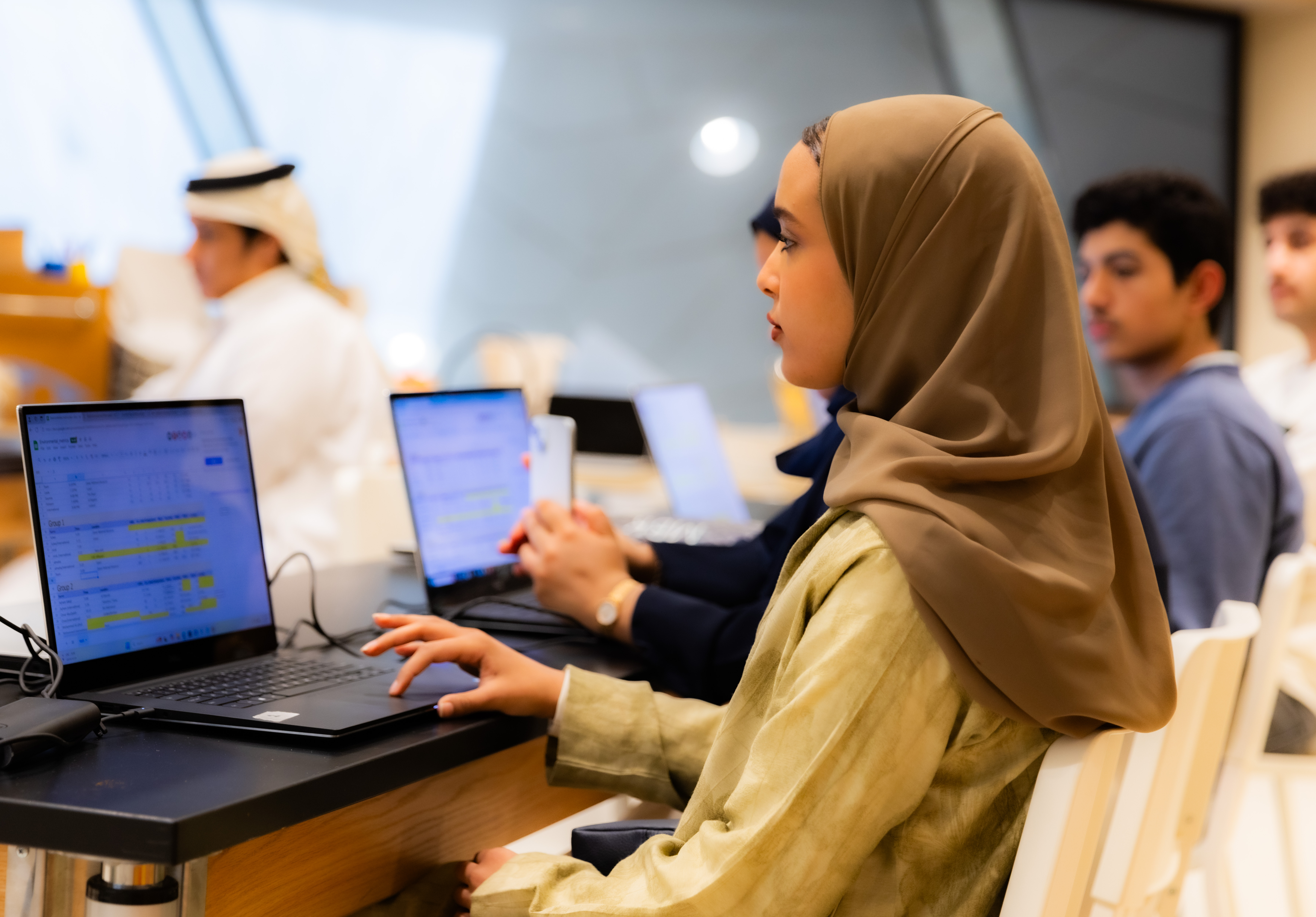
It’s important to engage the teen in thinking critically about methods for collecting data. Logs can be created using various mediums—such as audio recordings, drawings, or written notes, whether on paper or a computer. However, they should be organized and accessible in a way that allows for analysis and the identification of potential connections.
First Challenge: Through the use of different apps available to download for free, we are going to collect the following data in at least 3 different locations and at a different time.
The more data the better, it’s important to be precise.
Suggested tool for this step: Air Matters combined with the Weather app already installed on the mobile.
For this step we suggest to divide the participants in groups, so that they will be able to gather more data and also engage in meaningful discussions.
Always keep in mind the definitions shared before!
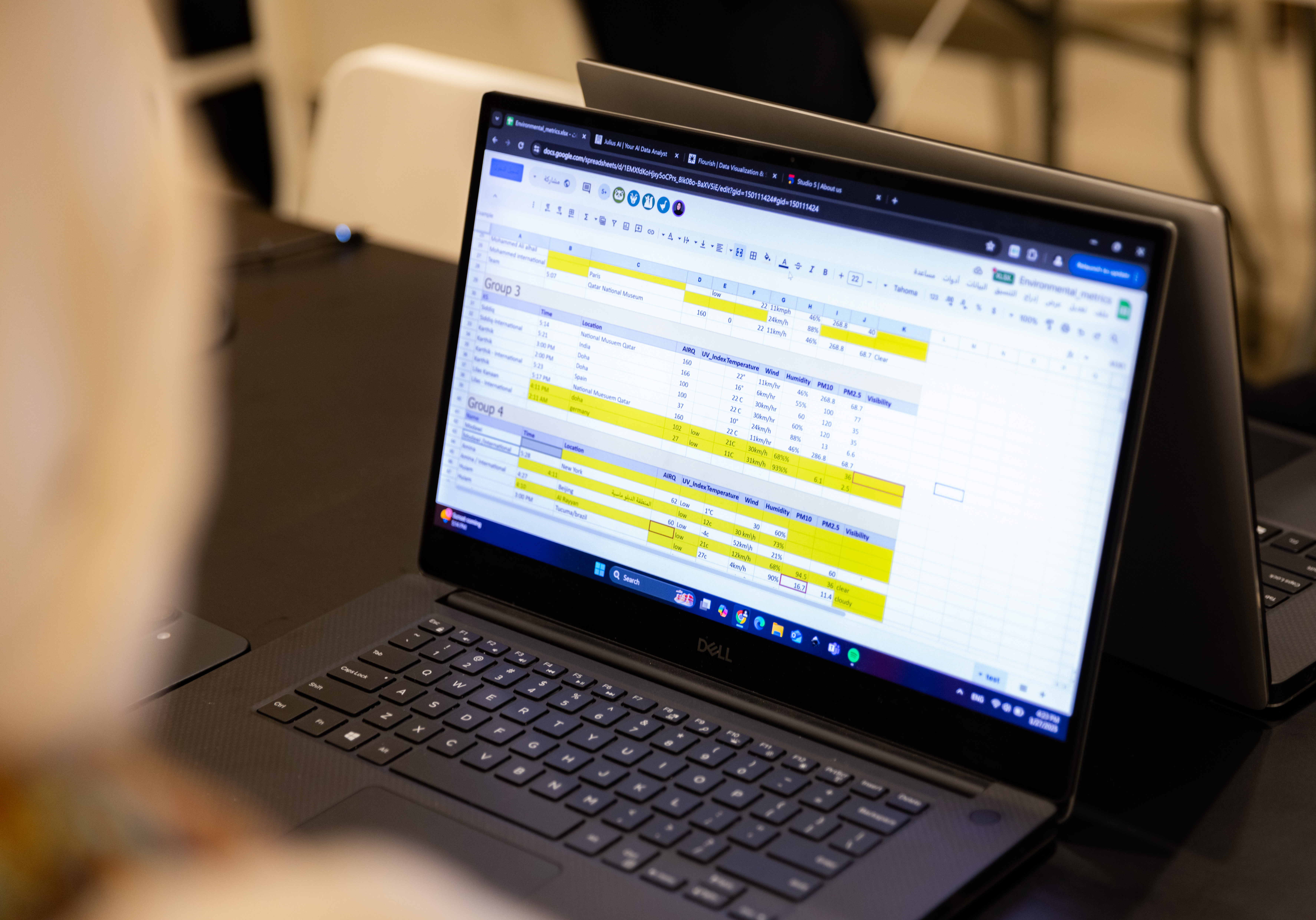
Add here the link of a shared excel where the participants can log their data.
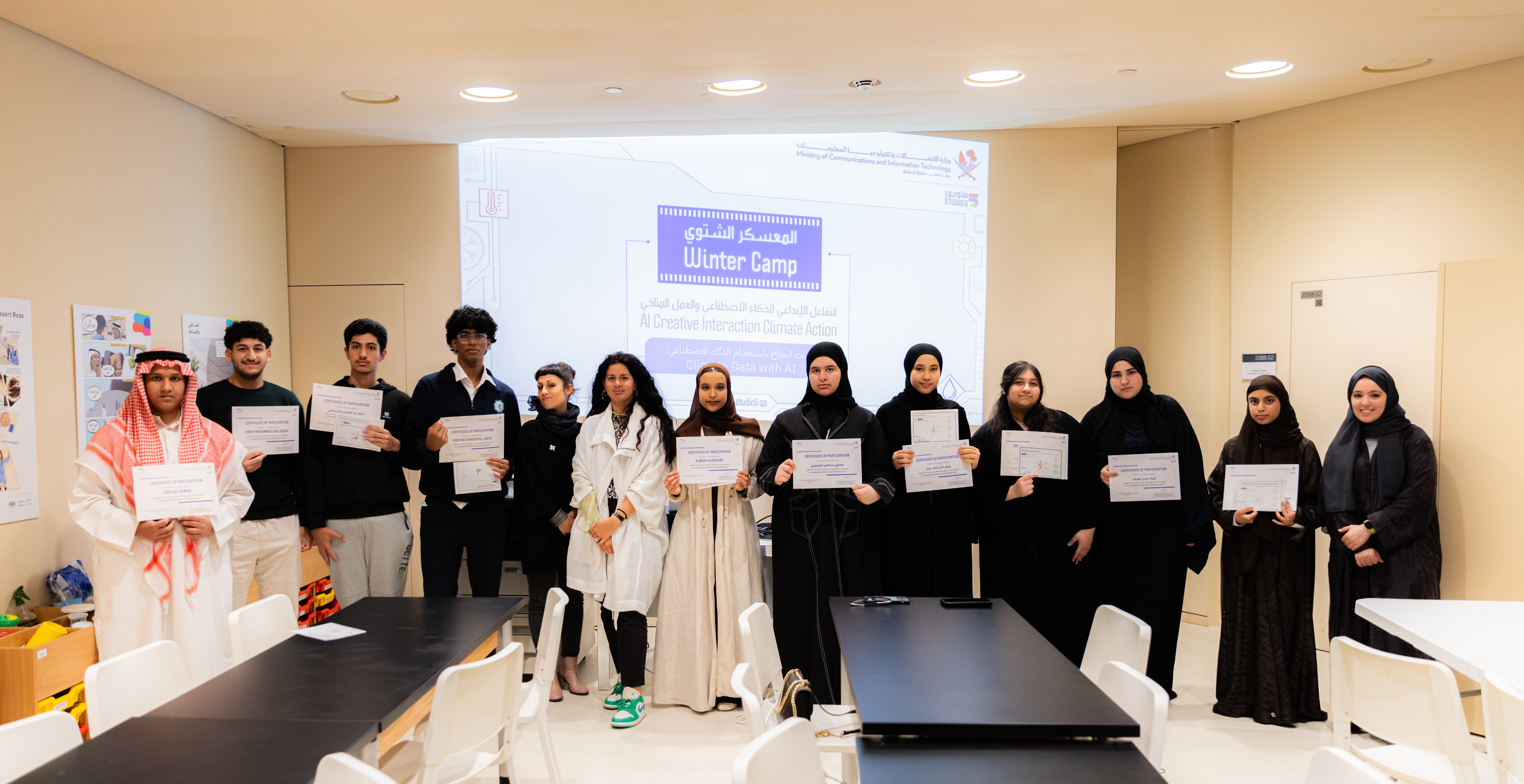
This workshop is designed to span across 3-days. But can be adjusted as needed.
Explore the role and value of generated data in scientific research.
What is a simulation, and why is it used in biotechnology?
A simulation is a virtual model that mimics real-world processes to predict outcomes and test scenarios. In biotechnology, simulations are used to study complex biological systems, reduce the need for physical experiments, save time and resources, and accelerate research and development.
StarLogo Nova is an open-source software platform that enables the creation of agent-based simulations. It is often used in education and research to model complex systems—for example, simulating the spread of diseases to understand infection dynamics in biotechnology.
Here a graph about the process:
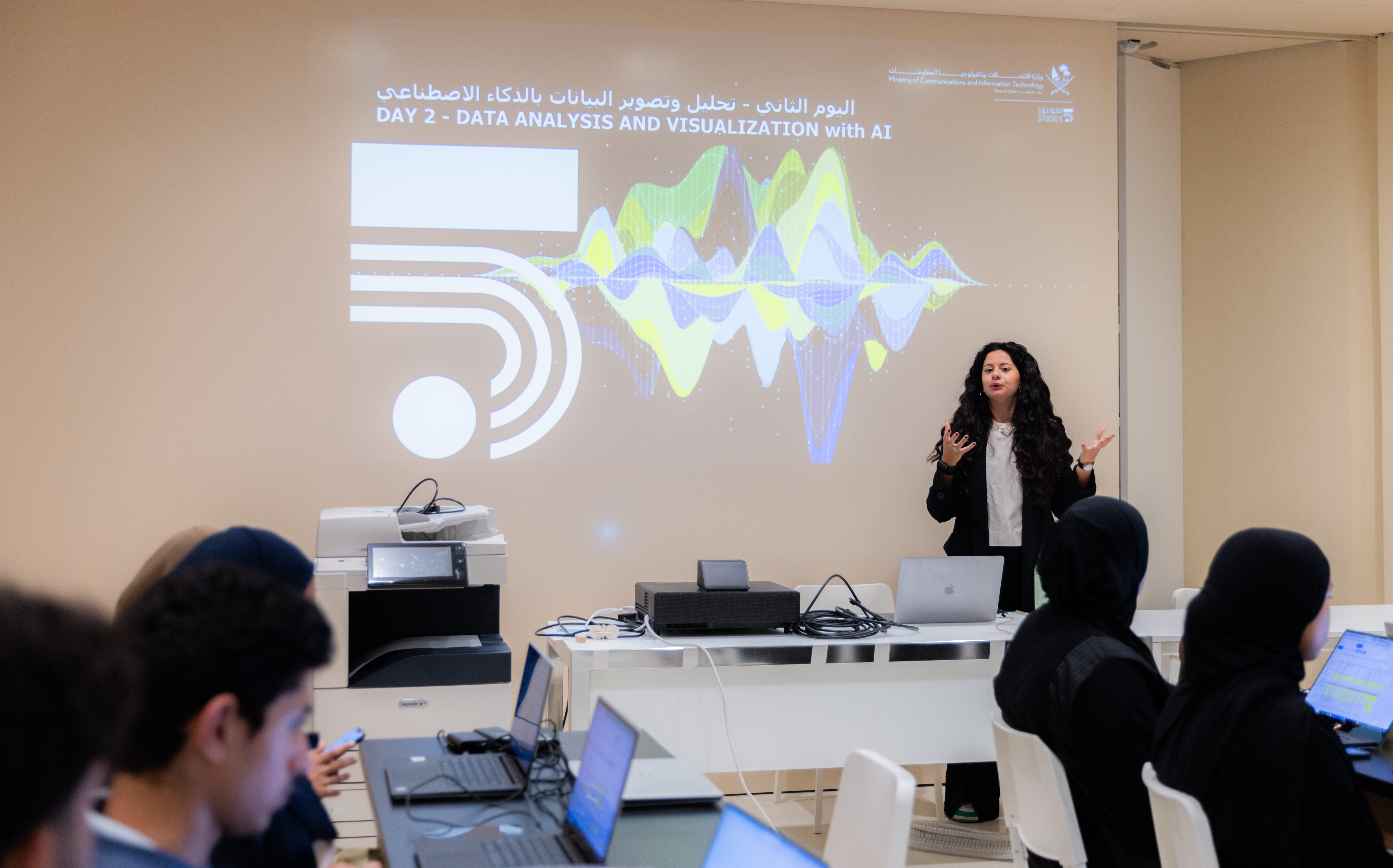
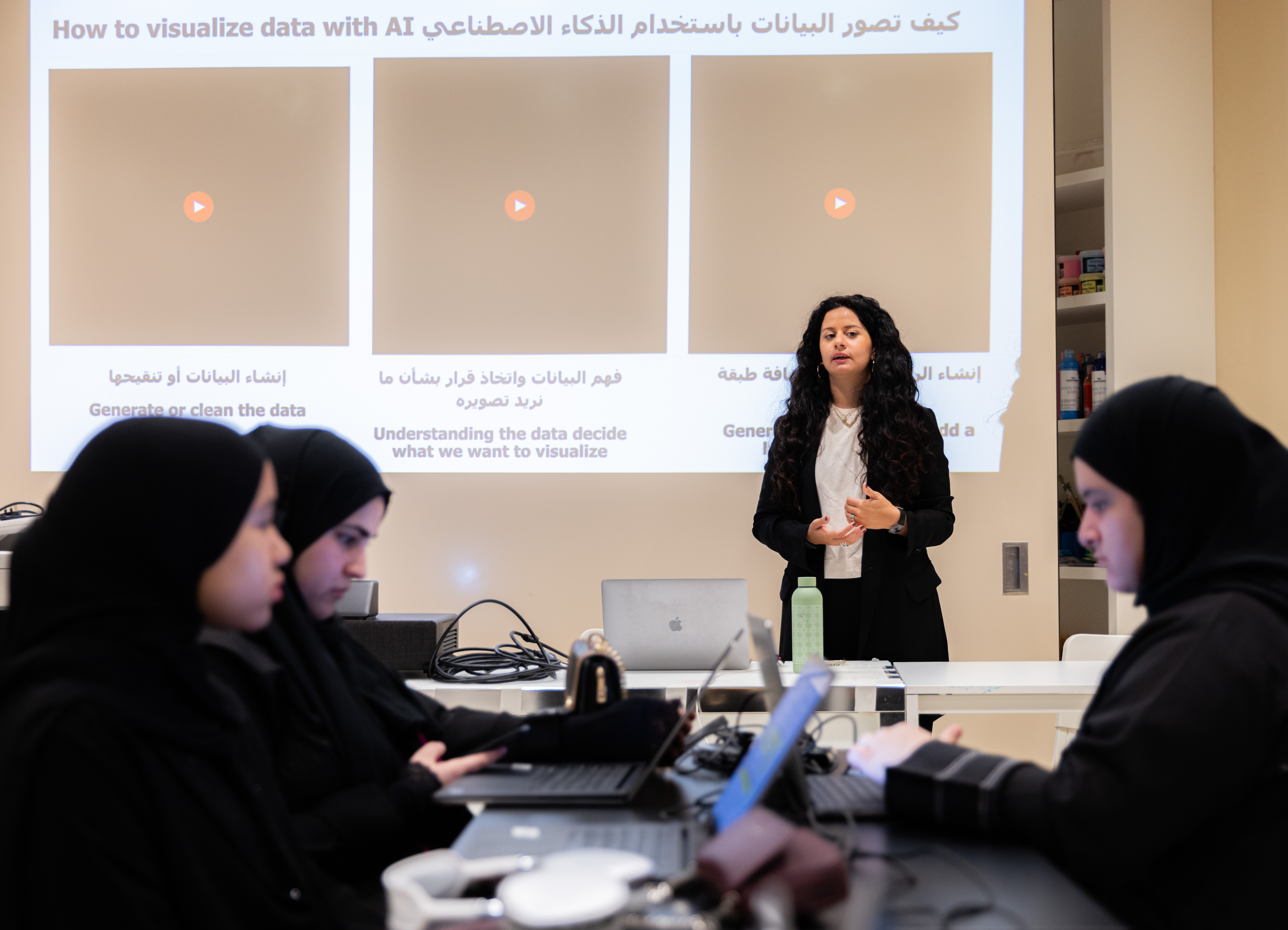
Data Analysis and Visualization with AI
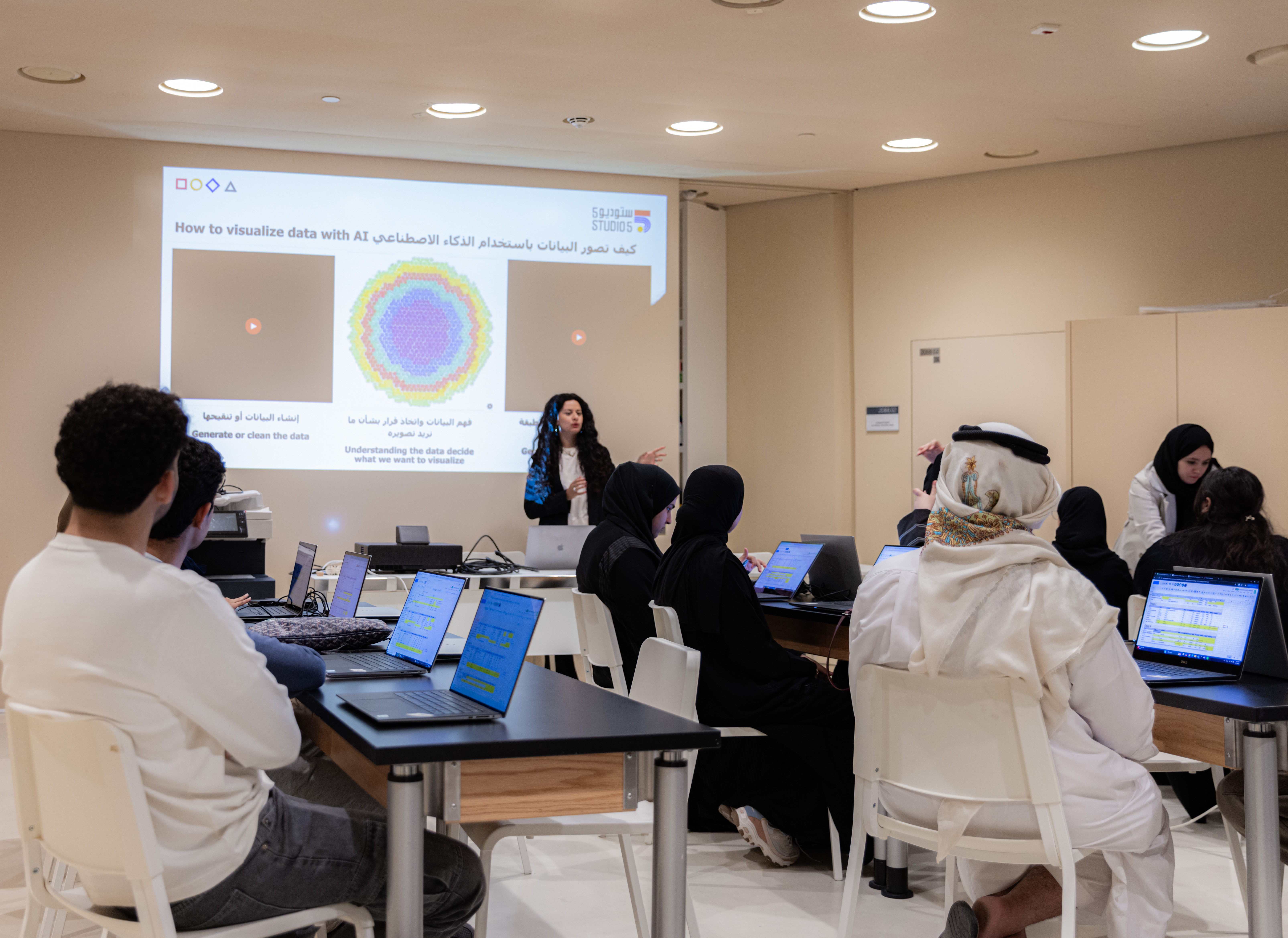
Best practices to create a great data visualization!
List of the projects: Plastic Air April 2021 | By Giorgia Lupi in collaboration with Google Arts & Culture Lab https://experiments.withgoogle.com/plastic-air Climate Change Impact Filter April 2021 | By Sey Min in collaboration with Google Arts & Culture Lab https://experiments.withgoogle.com/climate-impact-filter
For the session we are going to use Julius.AI and Flourish.
Let's learn the key features of the tool.
After presenting the key features, allow participants time to engage with the dataset. Encourage them to enrich, clean, and process the data, and to interact with AI to explore potential improvements or identify interesting patterns. This hands-on session should help participants understand both the potential of AI in the data field and its limitations and flaws.
Discover the key features in Flourish.
Now it’s time for a demo. Open the tools with the students and walk them through how to upload files and use the software. Demonstrate key features such as data input and color options, then give them the freedom to explore the tool independently. Allow around 30 minutes for each student to complete their own graph.
Data Creation using Digital fabrication
We are entering a new phase of co-creation with technology—one that differs significantly from previous eras focused primarily on production and distribution technologies. In this emerging phase, technology is not just a tool for making or sharing content, but a collaborative partner in the creative process. This shift is transforming how we generate ideas, make decisions, and interact with data, marking a move toward more dynamic, interactive, and participatory modes of innovation.
Follow the step-by-step instructions. Here is a pre-made template to help you structure your data visualization. Figma link: https://rb.gy/r9gslc
Or you can create a new template and use this slide to share it:
For the outcome of this camp we also explored the possibility to laser cut a frame to visualize the data or alternatively lasercut the all data visualization. In both cases we would have use the open source software InkScape.
Having trouble? Let us know by completing the form below. We'll do our best to get your issues resolved quickly.
"*" indicates required fields


